
jwj3400
[Front] Css 디자인 Flex/Grid 본문
Flex
Flex 레이아웃을 만들기 위한 구조
- html
<div class="container">
	<div class="item">item1</div>
	<div class="item">item2</div>
	<div class="item">item2</div>
</div>- css
.container {
	display: flex;
	/* display: inline-flex; */
}
Flex에 속성들은 컨테이너에 적용하는 속성
- inline-flex: 반응형으로 동작하지 않음, 화면 창이 작아지거나 하면 아랫줄로 block이 내려

- 아이템들이 배치된 방향의 축을 Main Axis, 그 와 수직인 방향을 Cross Axis라고 부름
- flex-directoin: 축의 방향을 결정하는 속성 즉, Main Axis의 방향을 결정
아래와 같은 4가지 방향이 존재
.container {
	flex-direction: row;
	/* flex-direction: column; */
	/* flex-direction: row-reverse; */
	/* flex-direction: column-reverse; */
}- flex-wrap: 컨테이너가 더 이상 아템을 한줄에 담지 못할 때 아이템 줄바꿈을 어떻게 할지 결정
nowrap은 화면에서 보이지 않고, wrap은 마지막 item이 아래칸으로 내려감, wrap-reverse는 반대로 윗칸으로 올라감
.container {
	flex-wrap: nowrap;
	/* flex-wrap: wrap; */
	/* flex-wrap: wrap-reverse; */
}- flex-flow: flex-direction과 flex-wrap을 한번에 지정하는 단축 속성
.container {
	flex-flow: row wrap;
	/* 아래의 두 줄을 줄여 쓴 것 */
	/* flex-direction: row; */
	/* flex-wrap: wrap; */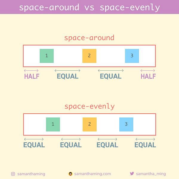
}- justify와 align: justify는 Main Axis 방향으로 정렬, Align은 Cross Axis 방향으로 정렬
.container {
	justify-content: flex-start;
	/* justify-content: flex-end; */
	/* justify-content: center; */
	/* justify-content: space-between; */
	/* justify-content: space-around; */
	/* justify-content: space-evenly; */
}
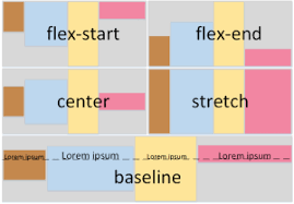
.container {
	align-items: stretch;
	/* align-items: flex-start; */
	/* align-items: flex-end; */
	/* align-items: center; */
	/* align-items: baseline; */
}
'코딩 > web' 카테고리의 다른 글
| [Front] React Router (0) | 2023.08.23 |
|---|---|
| [Front] CSS Margin, borader, padding 차이 (0) | 2023.08.22 |
| [Front] CSS 중앙 잡기 (0) | 2023.08.16 |
| [Front] CSS 포지션 (0) | 2023.08.14 |
| [Front] Webpack과 Babel이란? (0) | 2023.08.14 |
'코딩/web' Related Articles
more

